Netflix Wrapped
If you are unfamiliar with Spotify Wrapped it’s an end-of-year review of listening habits on the platform. Despite having a wealth of data, Netflix does not give users any personalised insights into their watching habits so I decided to take on the project for myself and call it Netflix Wrapped.
Netflix Wrapped was written using Python and Matplotlib. Within a week I was able to download my usage data, clean the data and create 5 data visualisations. Through this project, I gained experience with creating:
- radar graphs
- maps
- radial graphs
Below I’ll take you through what I did to prepare the data and what findings emerged. See my Netflix Wrapped essay for an extended discussion on what transpired during this project.
🌈 Genres watched
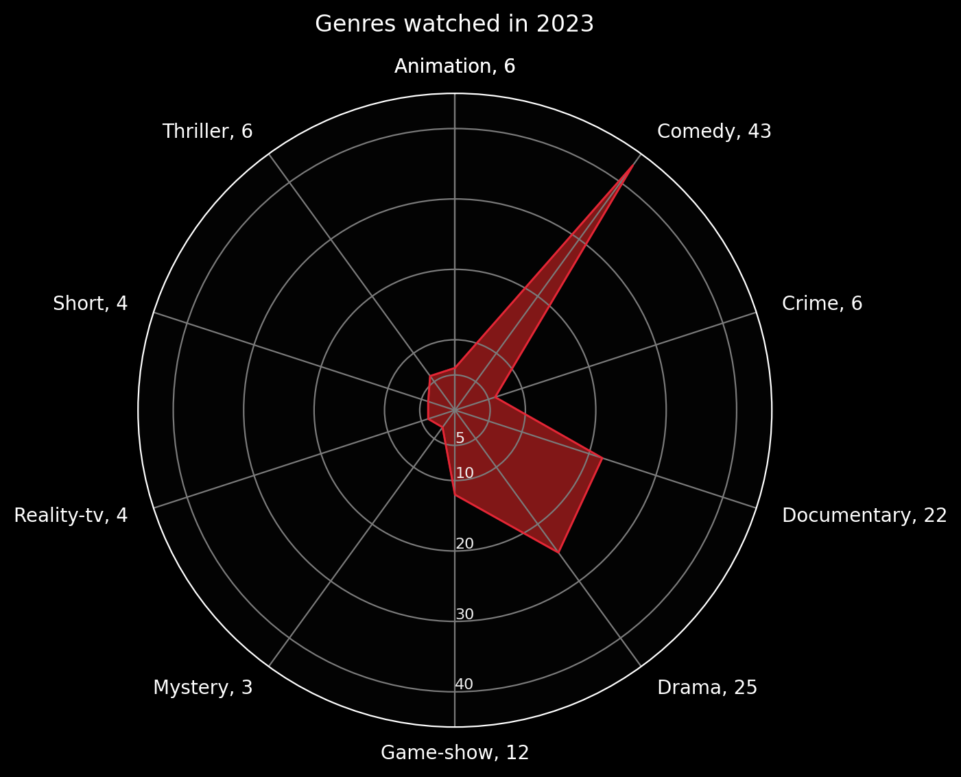
Here I pulled the 27 genre categories used on the IMDB and categorised every title on my list into a primary genre and secondary genre where necessary. One title represents a unique TV show or Movie title. My top 5 favourite genres were Comedy, Documentary, Drama, Game-shows, with Thrillers, Crime, and Animation tied for fifth place.
✈️ Geographic spread
.png)
For this visualization I categorized my viewing history based on the language and/or filming location of each title. Here I wanted to see what titles I watched that originated outside of Hollywood and the USA. I have managed to watch several South African, Brazilian, and Kenyan titles but most bizarrely 2023 had been the year of Australian content, where I watched 6 titles from down under.
🍿 Binge-watching
Key Stats
- In 2023 I watched 450 unique titles.
- 67 of these were once-off shows or movies and 383 were episodes in a series.
- Fastest watch time: 8 episodes in 1 day 🏁
It’s well-known that many video streaming platforms like Netflix and YouTube are built to keep you watching so you could say binge-watching is a key marker of success for these platforms. And let’s just say the house always wins. “